Plot Expression
Plotting a heatmap of protein/marker expression across cell classes is a core part of data exploration for spatial proteomics. It helps you characterize and validate celltypes & phenotypes, see that your classes make sense, and spot mislabeled or mixed populations.
Plot Heatmap
Here we show an example of plotting a heatmap of the expression of the celltype predictions.
To generate this heatmap go to the Plot menu and select Plot Expression:
The heatmap dialog will appear:
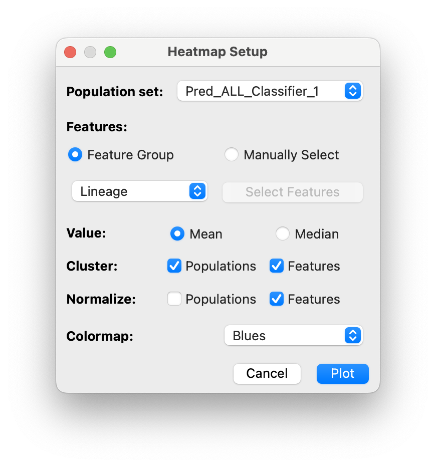
You can select several options:
- Included Features (feature group or manually selected)
- Cluster average statistic: mean or median
- Clustering of populations and/or features
- Normalization (using min-max normalization)
- Colormap
Then click Plot and your heatmap will appear!
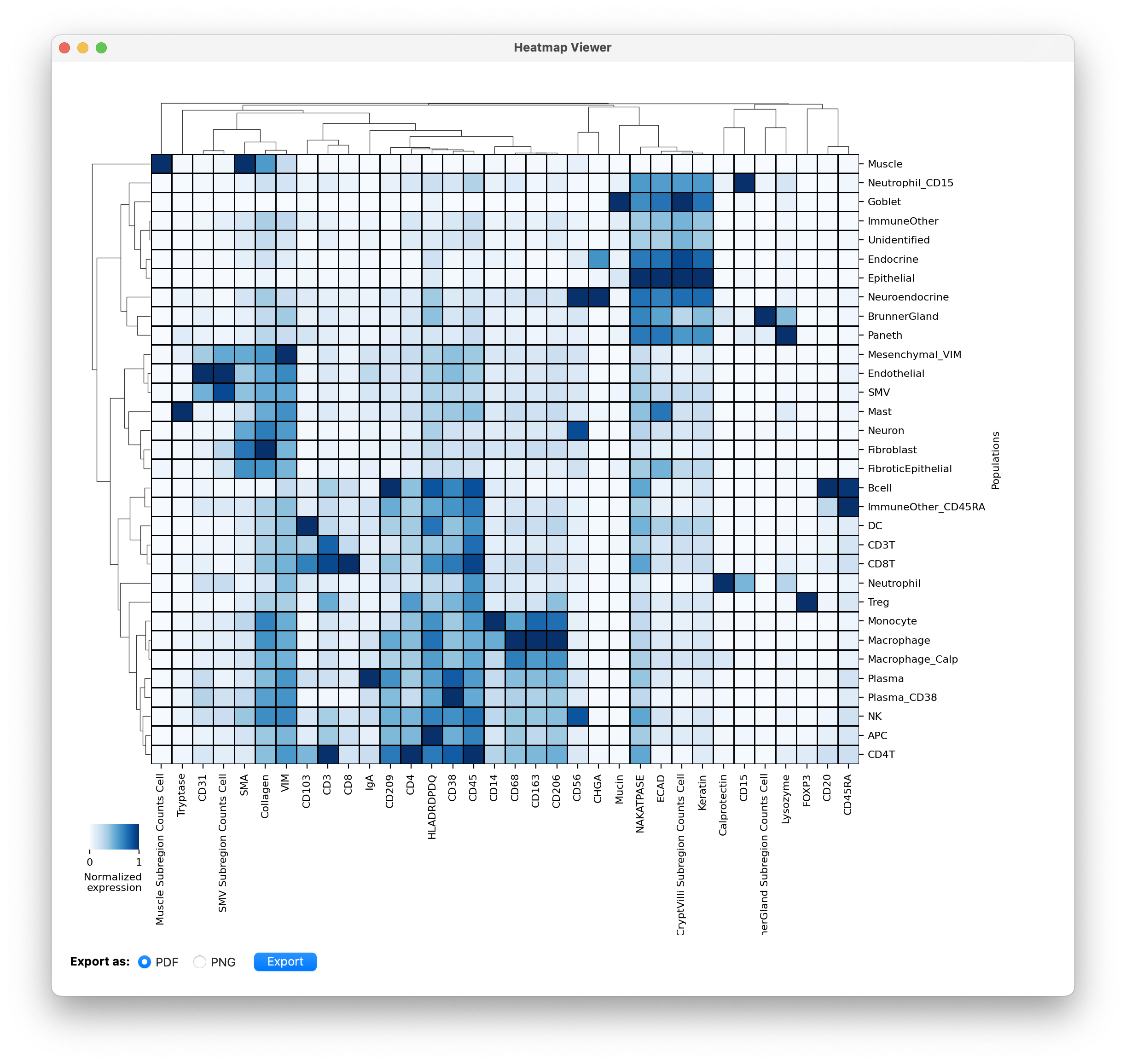
- You can export the plot using the button at the bottom left.
To evaluate celltype classifications we usually just include the lineage proteins in the heatmap. But after finalizing classifications, we are interested to look at what functional proteins each celltype expresses. (phenotypes). That will give us an idea of what proteins to include for phenotyping clustering that population individually. See an example of clustering CD8T cells into subpopulations next.